15 stunning online newsroom examples you simply must see
We look at some of the best examples to see what they have in common.
Online newsrooms make it easy to share news in a creative and beautiful way, while establishing a source of truth for your brand that journalists and fans can return to again and again. But what makes an online newsroom GOOD?
We've dug into some of the most high-trafficked newsrooms on Prezly to find out. Before we get into that, let's get a few basics out of the way to make sure we're all on the same page.
Publish your own newsroom in just 5 minutes
Create a fully branded, multimedia, multi-language newsroom right now with a 14-day free trial of Prezly, no payment info required.
An online newsroom lives to tell the story of your brand in full accuracy and full colour. It is your opportunity to sculpt your own narrative. In addition, it gives you a super convenient place to store all your media assets and distribute them easily with your media contacts.
It can include things like:
- Press releases organized by category
- Company announcements
- Dedicated media gallery
- Embedded video, audio & social media posts
- A downloadable press kit
- Company boilerplate & contact information
- Details of press officers
- Newsletter sign-up
Basically, everything anyone could need in order to tell a story about you.
The key parts of every great newsroom are branding and ease of use. What exactly do we mean by that? Come join me for a walk through four of our real-life newsroom examples and I'll show you.
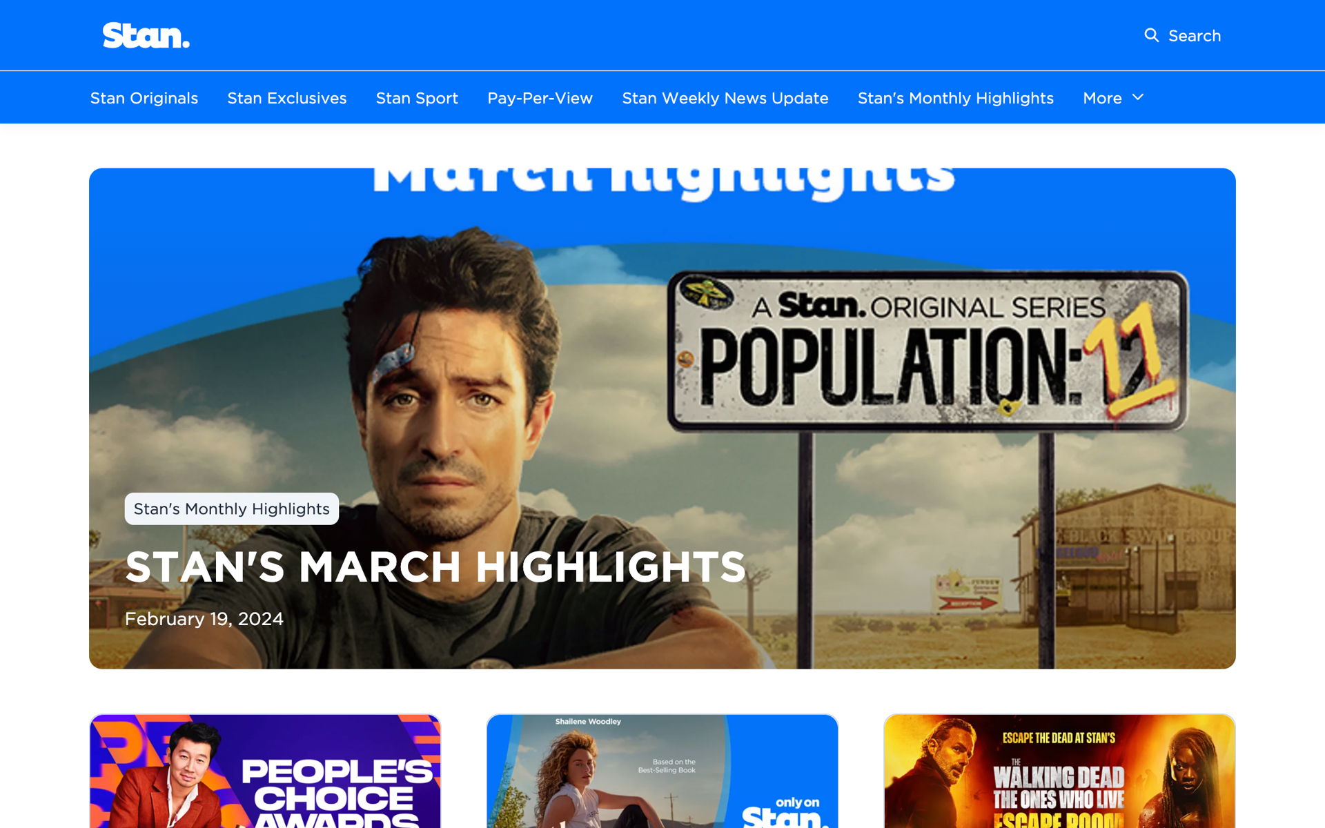
Try Prezly for freeStan is a world-class subscription video-on-demand service for Australian consumers (think Netflix, but for Oz). This means they have a constantly updating library of movies and TV shows. So being able to categorize press releases logically is essential, allowing visitors to easily find the news they're looking for.
The addition of the subscription form in the newsroom footer means that any fans can sign-up to get Stan's latest updates – which makes massive sense for a brand as customer-facing as this.
Insider tip: Stan's newsroom was a custom build on top of Prezly's newsroom creator, but there are also professionally designed newsroom themes that you can try straight out of the box with a 14-day free trial.

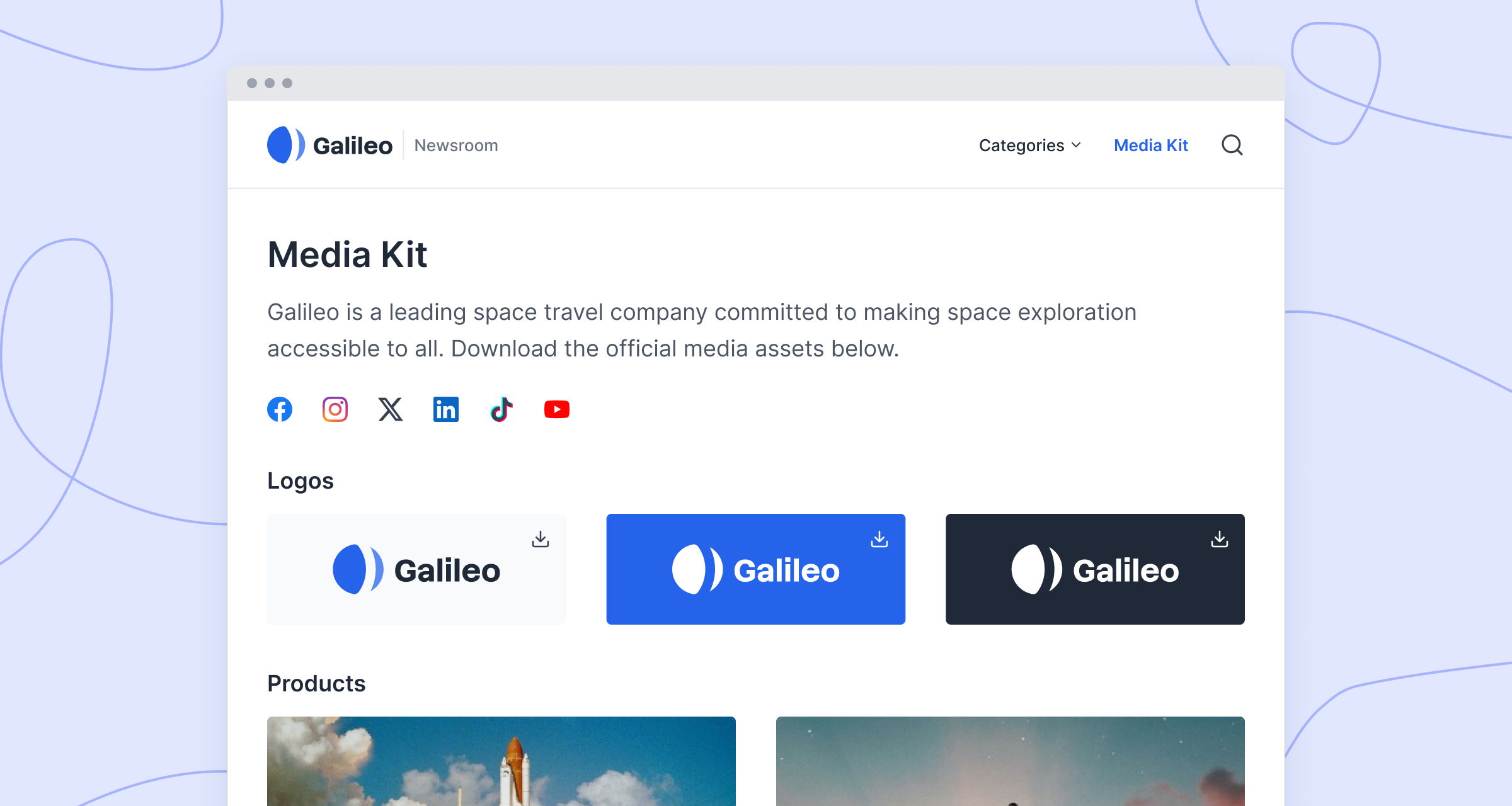
Example: Stan: A multimedia press hub with an email subscription form
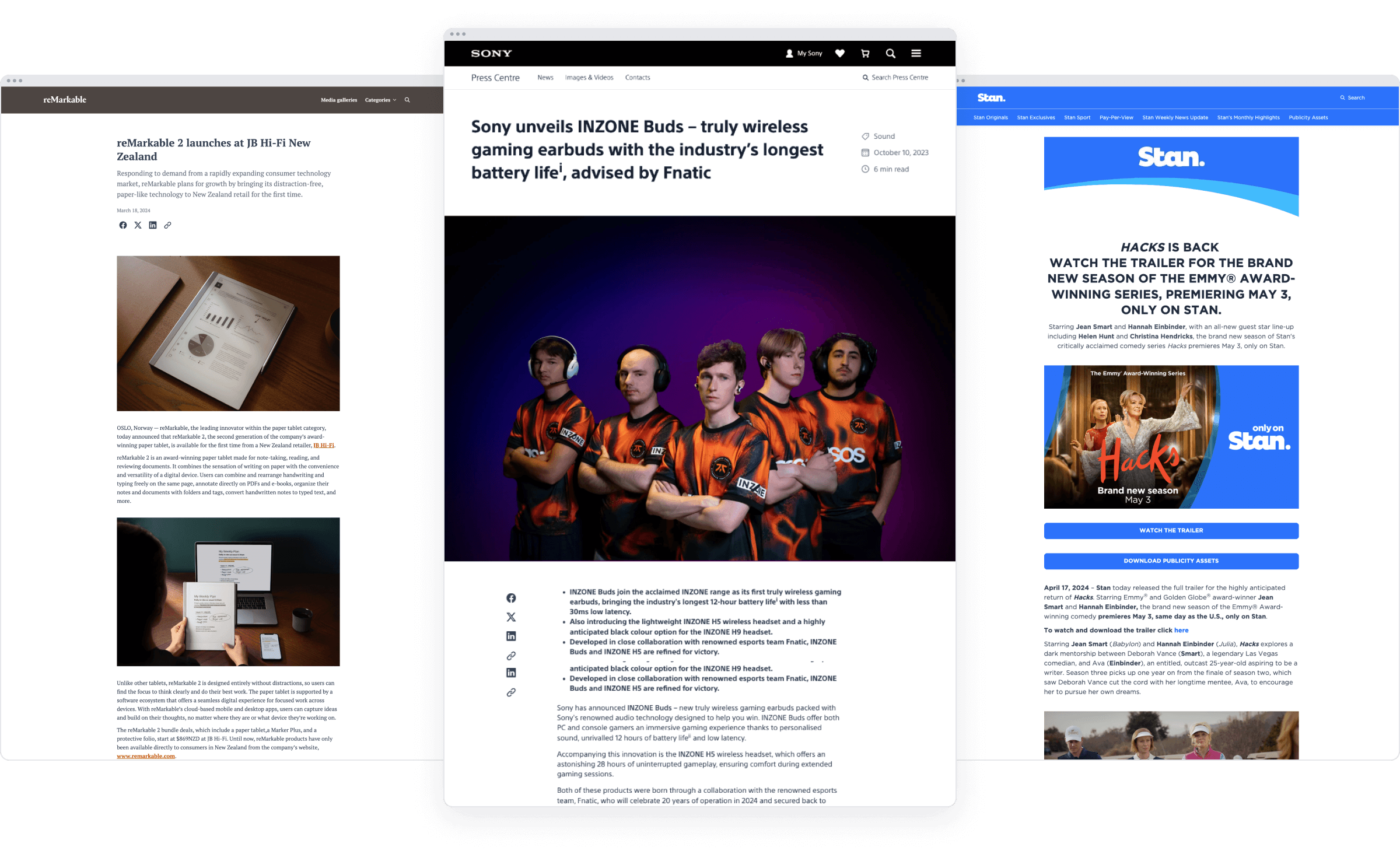
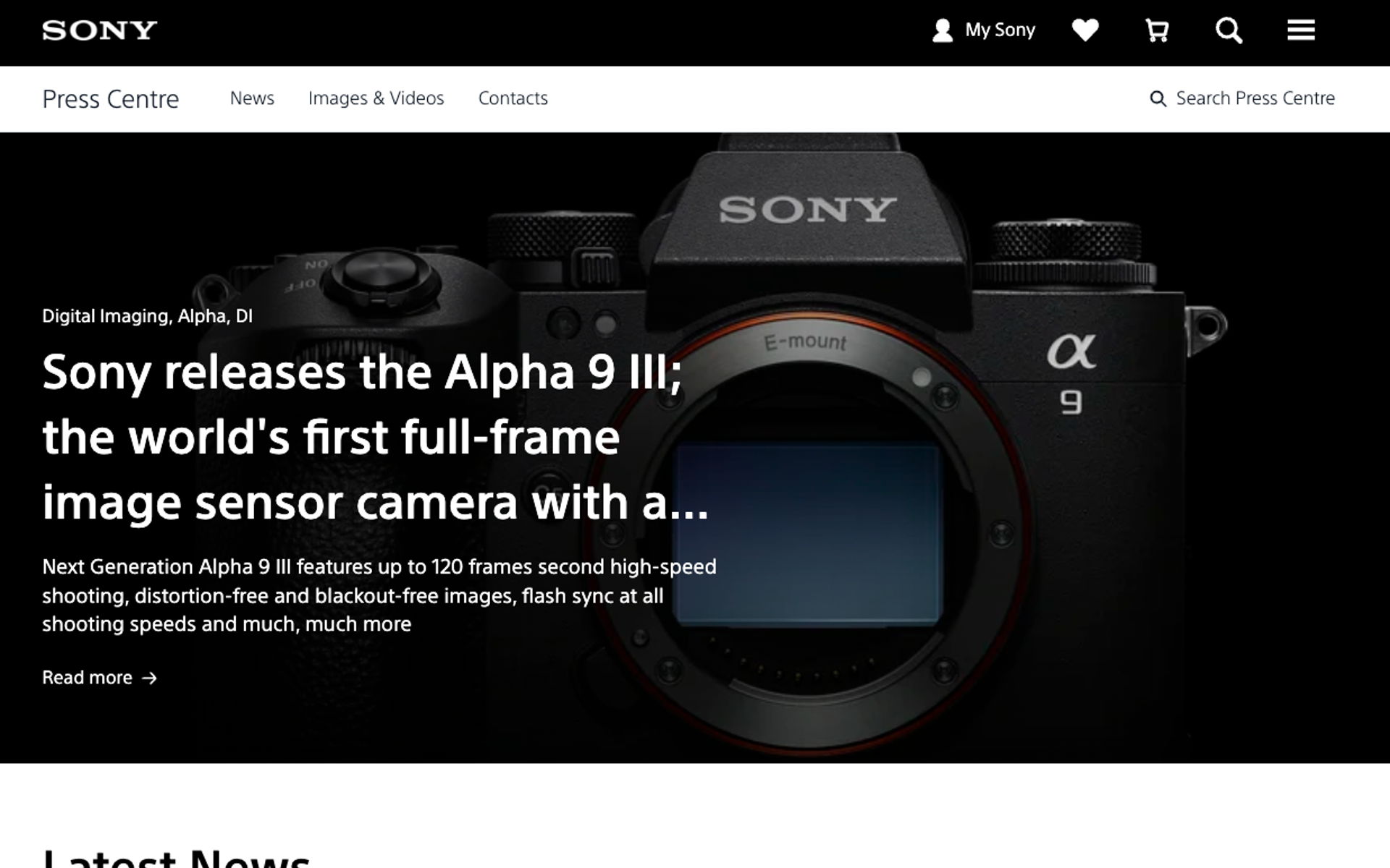
Sony's newsroom has all the same elements as Stan's, but reimagined for a slick, global tech brand. Because the subject matter relies more on the technical details, Sony use longer headlines and description text for their stories. Like with Stan's newsroom, you can see that categorization is a must for helping any wandering journalists find precisely what they're looking for.

Example: Sony equips journalists with the assets they need to tell their story
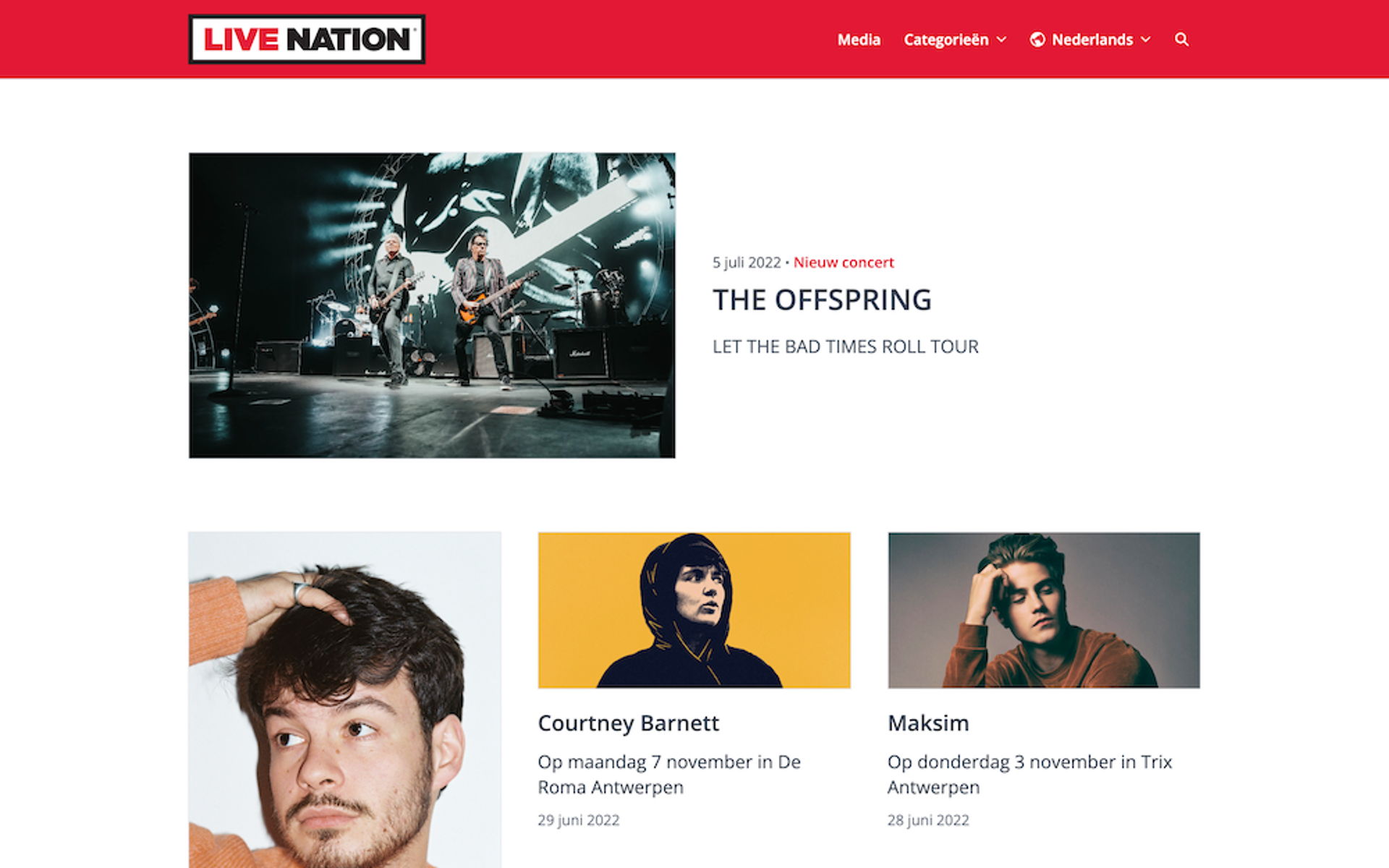
As the world's second-largest live entertainment organizer, Live Nation uses its newsroom to announce gigs like The Offspring's Let the Bad Times Roll tour – which I may have gone to see in Berlin last year and which was absolutely excellent – to journalists and fans alike. That means it needs to be accessible to regular joes like yours truly, not just the media.
Live Nation pulls this off flawlessly by using clear headlines, vibrantly coloured images, and our old favorite, the email subscription form. You can also view the newsroom in different languages, which again adds to the accessibility.
Insider tip: Live Nation built their online newsroom with an out-of-the-box, professionally designed Prezly site. These are plug-and-play, meaning all you need to do is add your branding, and take it live!
Example: A bold newsroom to showcase the biggest gigs
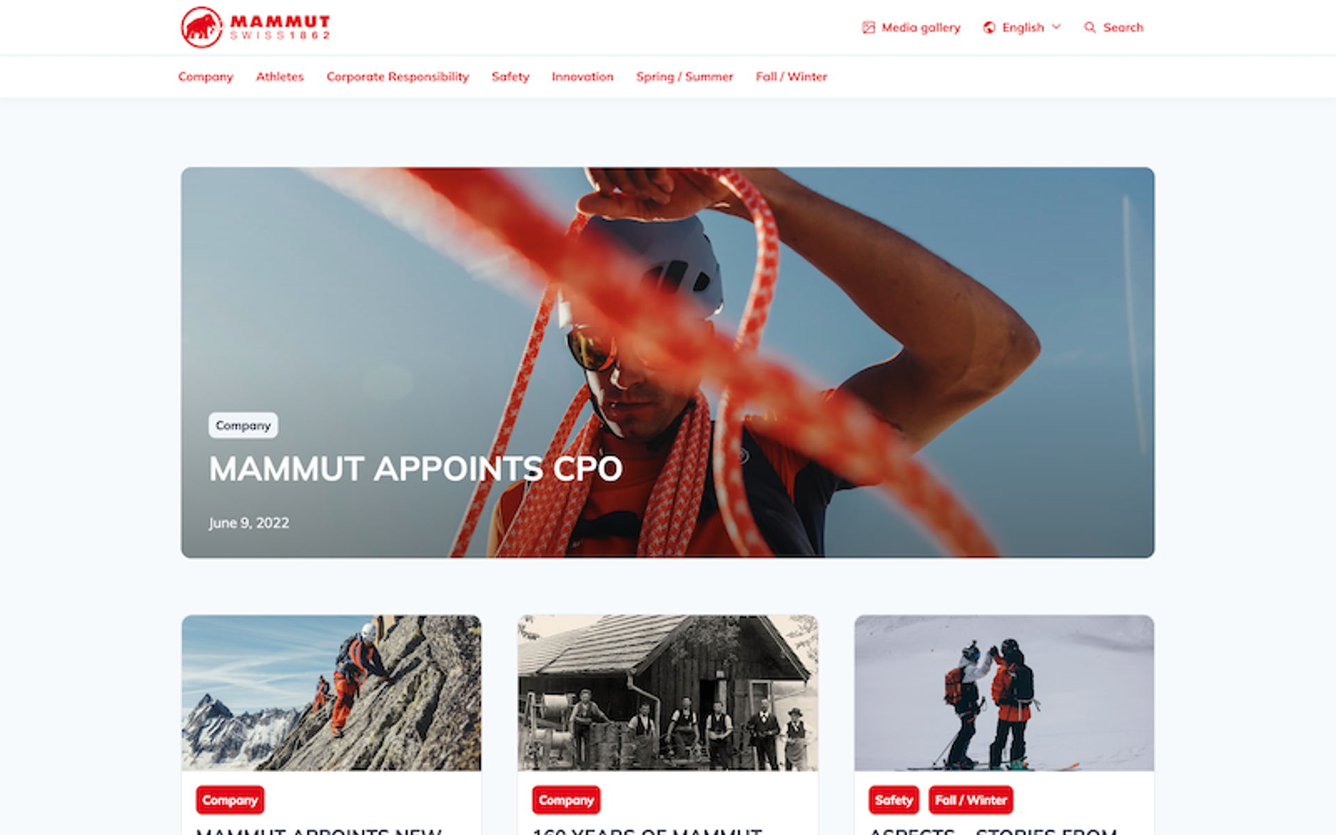
Another visually stunning newsroom, this time using our jaw-droppingly lovely Lena theme (which comes part and parcel in Prezly's free trial – have I mentioned that yet?).
Adventurists Mammut speak to their tribe with a visual-heavy approach that draws in likeminded masochists by depicting reckless enthusiasts vibrantly scaling mountains, skiing down something high, or otherwise laughing provocatively in the face of their own mortality. There's even a link to a media gallery in the top navigation for anyone looking to live vicariously through the lens of these people, whom the good lord has blessed with a few too many spoonfuls of joie de vive, or to use some approved shots in their coverage of Mammut's latest stories.

Example: An elegant newsroom that radiates authority
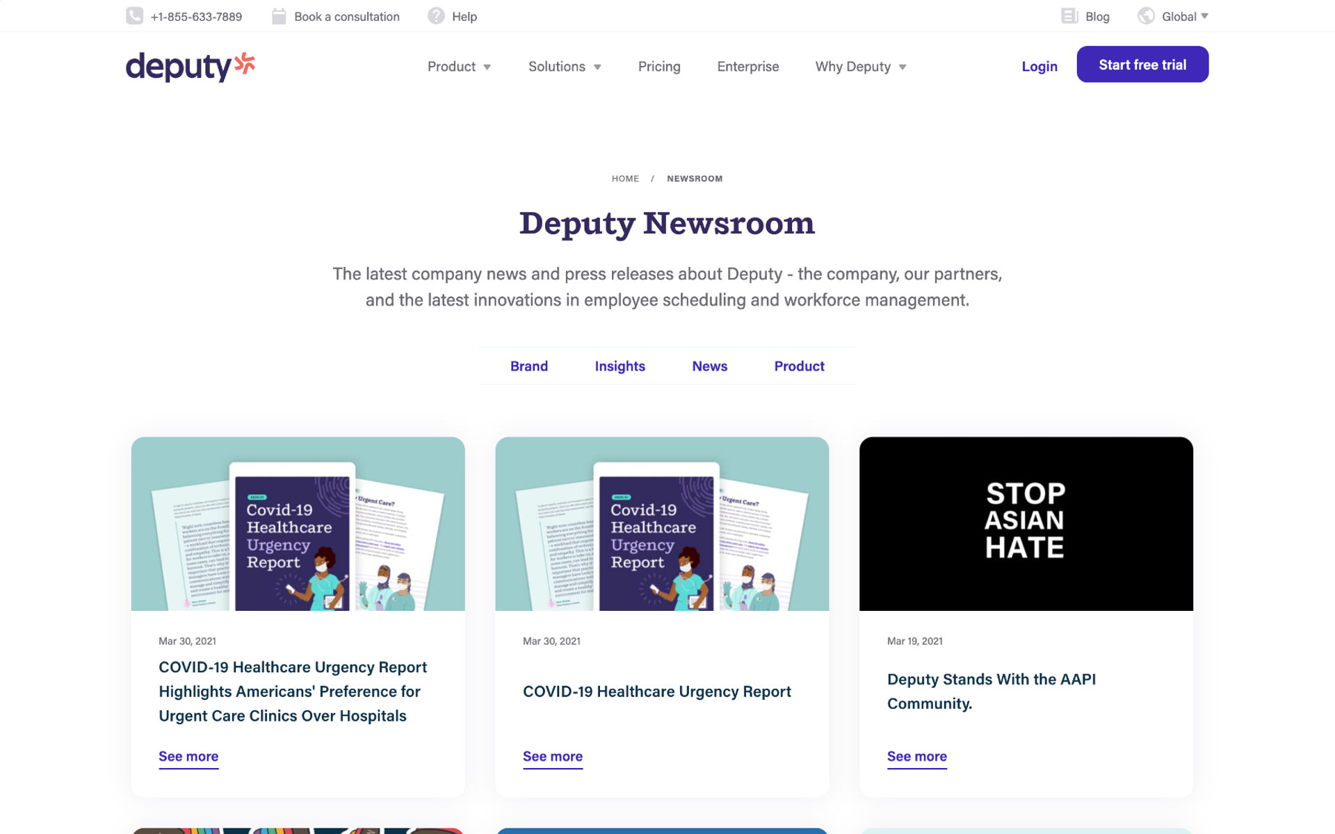
Deputy's online newsroom is downright stunning, incorporating eye-catching images, clear headlines and different categories within a neat layout to create a resource that's both beautiful and functional.
It's like a journalist's dream.
This newsroom is hosted in Prezly, so retains the advantages of our integrated PR CRM, coverage and campaigns features. However, Deputy went a step further by integrating the newsroom seamlessly with their own website, complete with custom URL.
That means that they use Prezly as the backend powering their newsroom, while their native site code provides all the style and formatting. Neat, right?
Insider tip: Interested in building on top of Prezly? Check out our open API and Open Newsroom Themes to do pretty much anything you like with your newsrooms.

Example: Custom newsroom design, Prezly under the hood
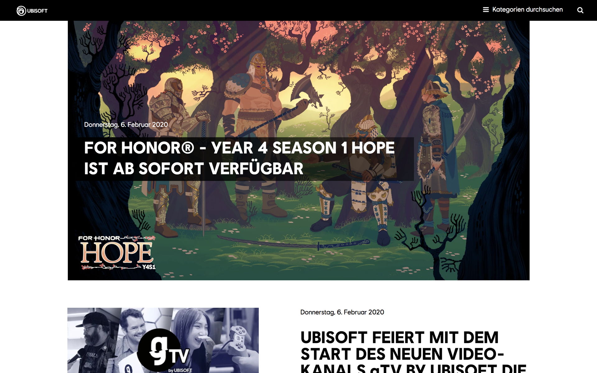
Ubisoft's custom newsroom has everything – stunning imagery, immediately recognizable branding, categories, press contacts, boilerplate, newsletter sign-up, social links, and more.
A major benefit of a multimedia newsroom like this is that it acts as your online press kit, playing host to all the assets influencers, reviewers and journalists might need to cover your latest stories, while being engaging enough in its own right to act as a direct source of news for non-media fans.
See a press release example from Ubisoft ▸

Example: Ubisoft has built a brand legacy through storytelling
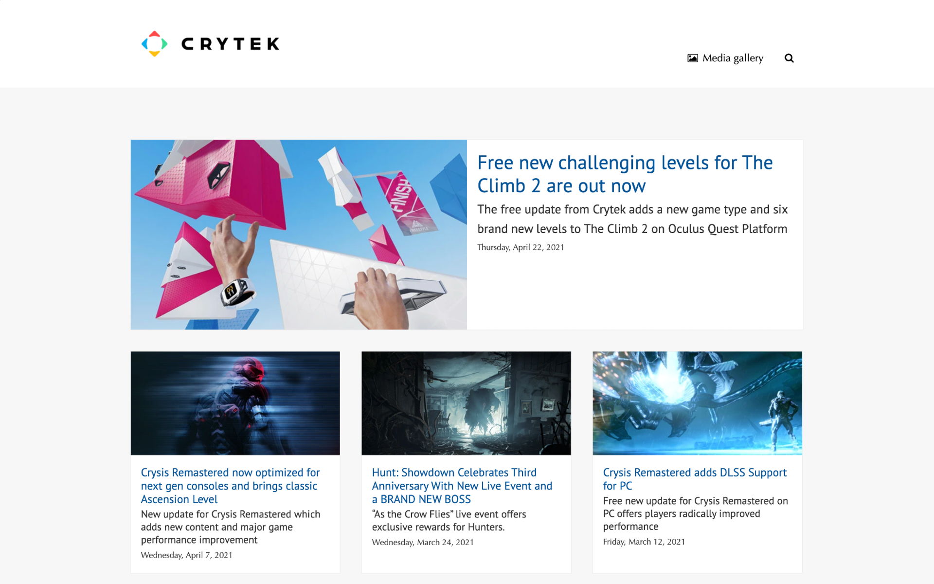
Unlike Ubisoft, Crytek chose to keep the top of their newsroom free from too much navigation. Instead, the company info and addresses are found in the footer, right by the newsletter sign-up and social links.
Given that players in the gaming industry keep such a close community with their fans, it's normal for gaming newsrooms to speak straight to the gamers rather than being targeted exclusively at career journalists. That's why it's important to mention those social links in the footer.
See a press release example from Crytek ▸

Example: A newsroom for fans & media
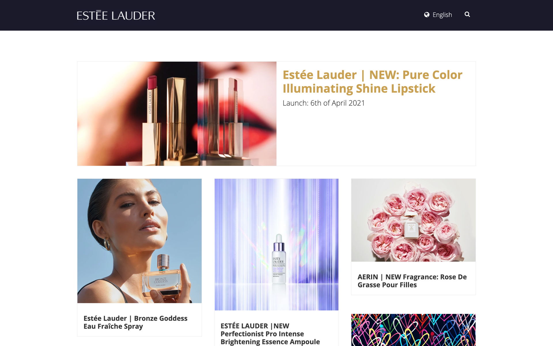
While Estée Lauder's newsroom may seem very minimalist, they have made slight stylistic tweaks to the standard layout to convey a continuity of branding across all their online assets. The changes are subtle but effective:
- The coloured banner
- A high-resolution logo
- Customized typeface
- Gold font for the feature story
They've also elected to draw attention to their newest story not only by changing its header colour to gold but also by having it display horizontally across the screen right at the top. This ensures it stands out while preserving the history of the brand's recent updates in the feed of story cards below.
You'll also notice that they've enabled the multilingual feature for their newsroom, making it easy to link to a particular translation of the newsroom just by adding the corresponding country code to its URL, such as https://esteelauder.prezly.com/en for English and https://esteelauder.prezly.com/fr for French.
Insider tip: Use Prezly's AI auto-translate tool to instantly translate your press release into one of 30+ languages in seconds.
See a press release example from Estée Lauder ▸

Example: Subtle branding that makes a newsroom feel unmistakably theirs
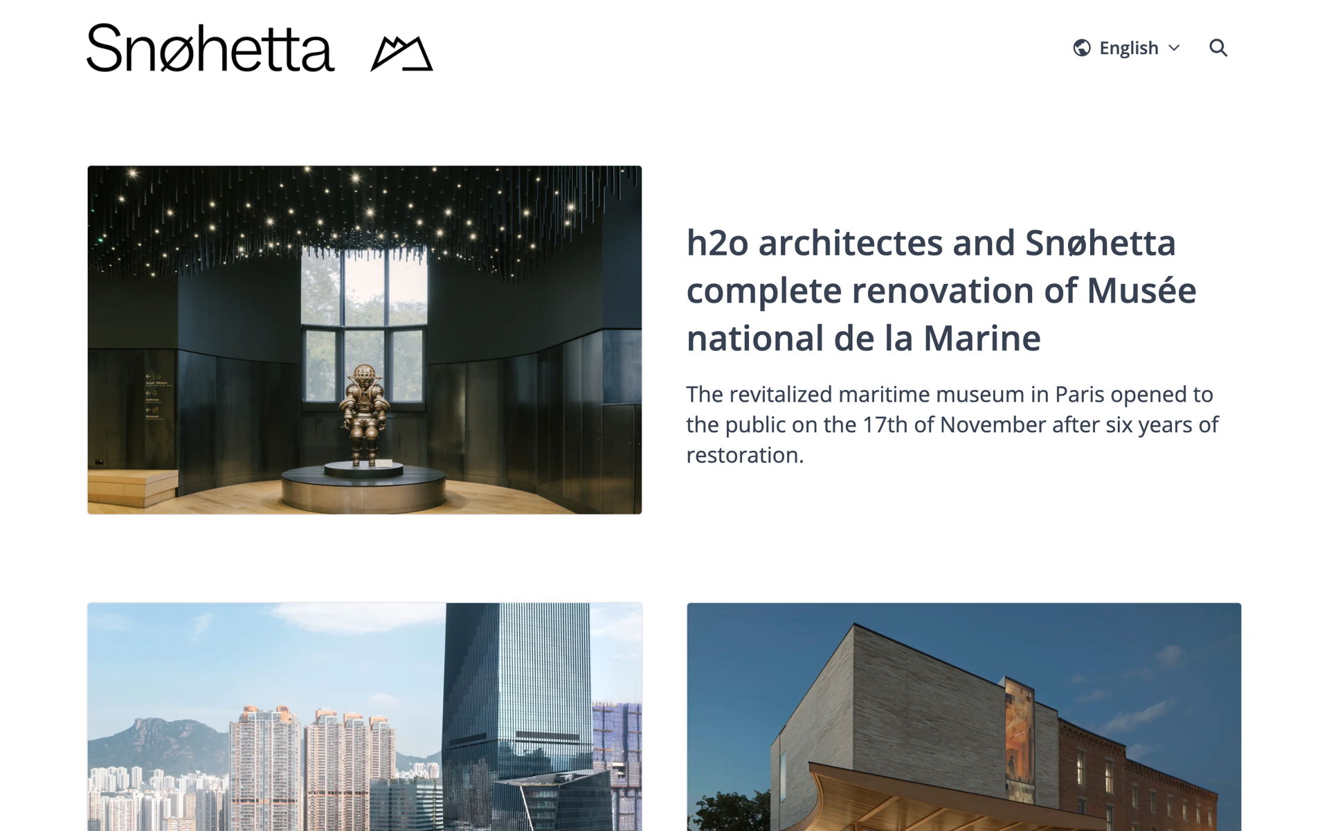
Speaking of minimalist and chic, take a look at this example from design agency Snøhetta! Isn't it just gorgeous? Again, we have the standard building blocks of any great newsroom – bewitching images, clear headlines, boilerplate, and so on – but here the contrast against the white of the newsroom background makes the whole pressroom scream "class".
The toggle at the top of the page makes it easy for anyone visiting to switch between the English, French, Danish, and Norwegian versions of the newsroom, while the footer provides key press contacts and information on the brand.
Snøhetta is using Prezly's Bea theme to create its clean online newsroom – why don't you try it on with a 14-day free trial? (No payment info required) :)

Example: Snøhetta: An online newsroom available in four languages
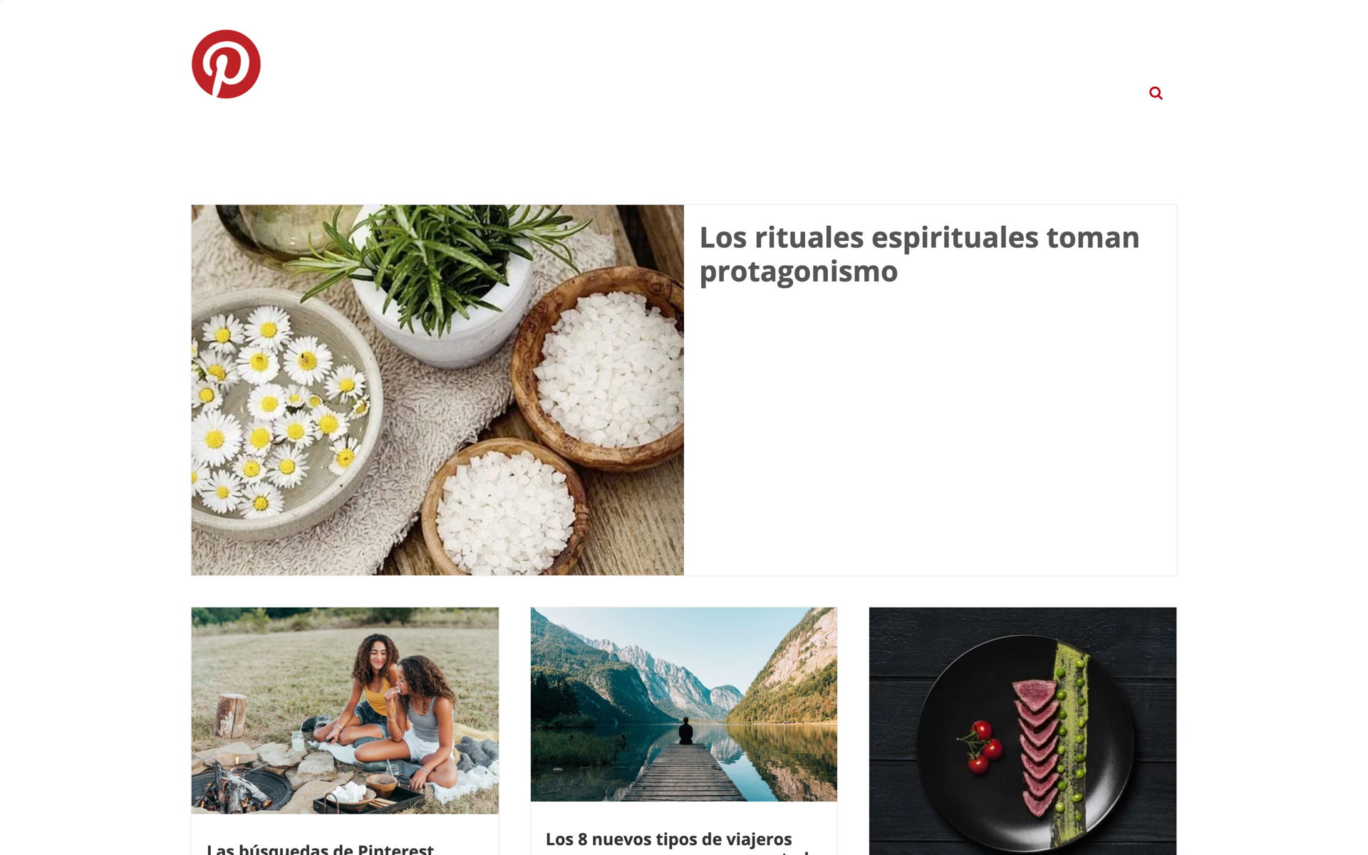
Pinterest's newsroom is exceptionally on brand, given that its platform is the go-to place for curating collections of stunning images with minimal text. It's no surprise then that its newsroom is similarly visual-first.
Again, the top navigation is kept clean, instead inviting the viewer to scroll down (I would bet that most people make it halfway down the page max before being tempted into clicking on one of those tantalizing pictures!). Press contacts and a brief company PR boilerplate appear at the bottom, while their list of social media profiles is where the bulk of the links come in – unsurprizing for a social platform like Pinterest.

Example: Keeping it on brand
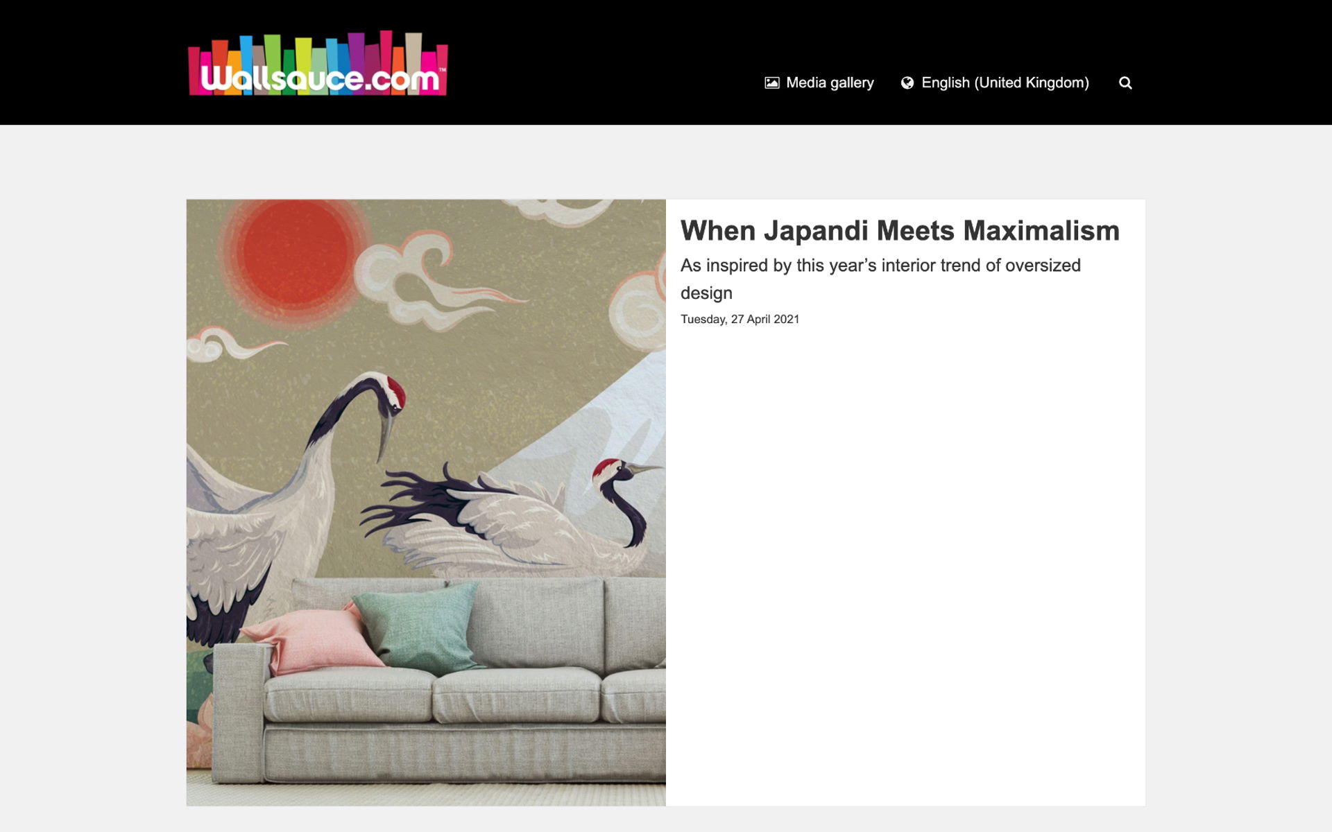
For another example of a beautiful, visually rich newsroom, check out Wallsauce. Not only do they consistently use high-quality pictures for their story overview cards, they curate a really wonderful media gallery within their newsroom – just take a look.
As a result, the whole newsroom functions as a really chic and easy-to-use press kit. Psst, you can make your own online press kit!

Example: A wealth of visuals
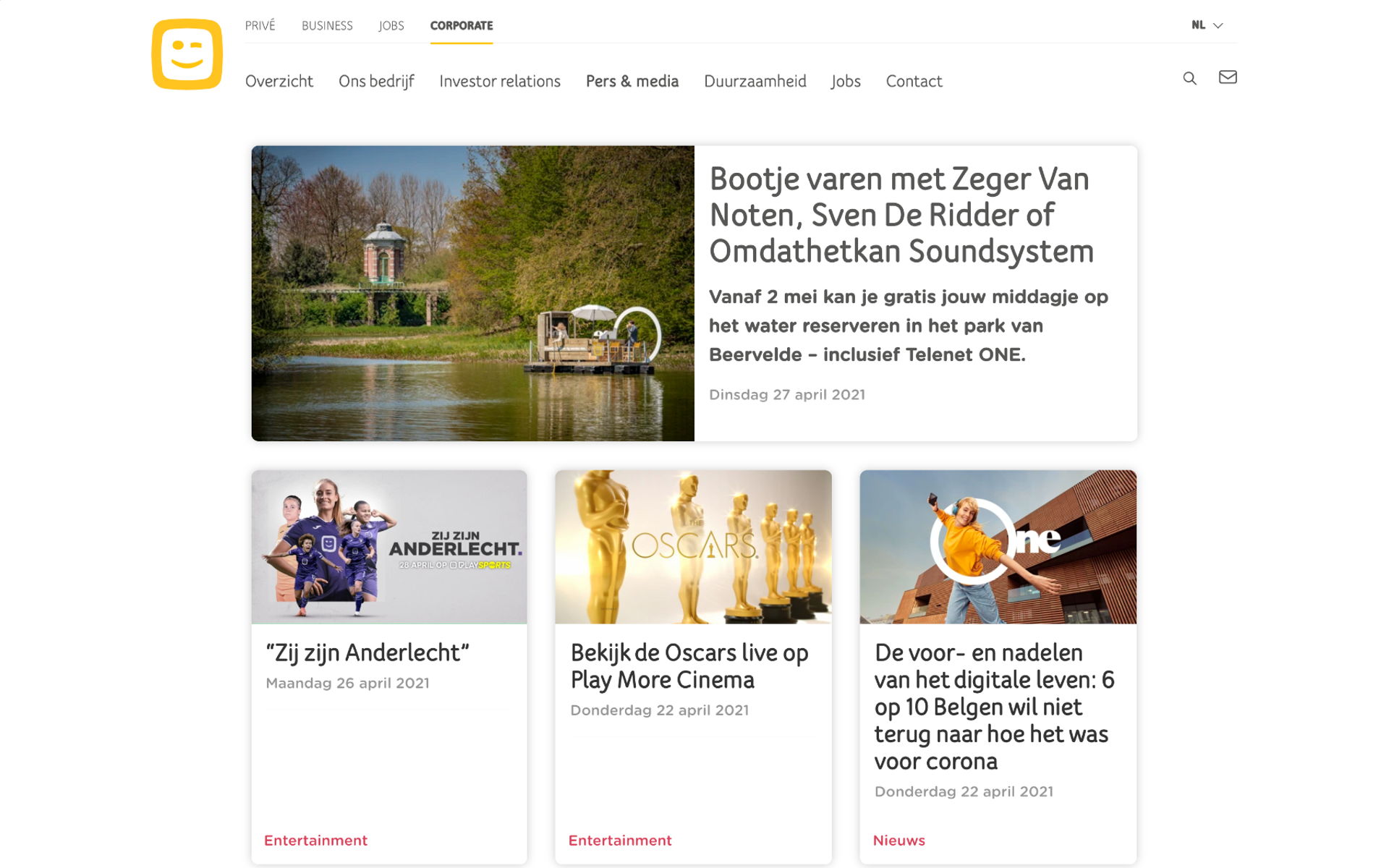
Telenet uses a highly customized header and top navigation for its newsroom, to ensure the brand is kept consistent across all of its web assets and to easily bring together several different webpages. The result is a clean, on-brand newsroom that's instantly recognizable.
The separate links for contact details and categories in the top navigation bar, along with the search function, make navigation a breeze – something your media contacts are sure to appreciate instead of searching through their inbox or trying to keep up via Google searches.
(Don't take our word for it – check out our interview with freelance journos Holly and Kelsey for insider info on exactly what turns them off about downloading digital assets.)
See a press release example from Telenet ▸
Example: Integrated newsroom design
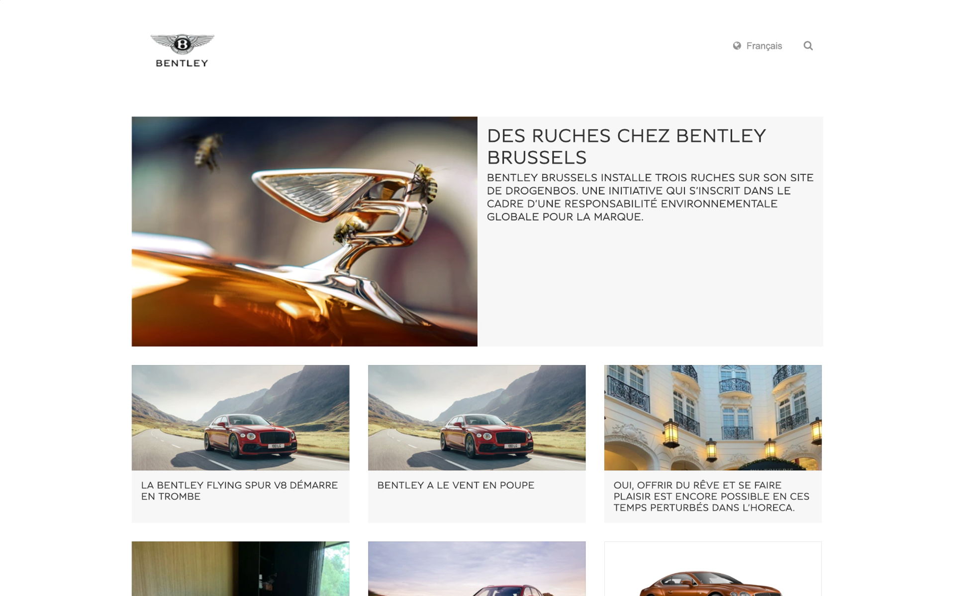
Bentley develops and engineers beautiful cars, so there's never any doubt that their newsroom would channel that same upmarket, dynamic style. High-quality images are used throughout to make each story pop and tempt any gearhead into clicking to learn more, while the rest of the newsroom flaunts a clean and minimalist style.
At the very bottom of the page, a row of logos subtly links together other brands in the D'Ieteren group.
Notice that Bentley too has the language dropdown in the newsroom header. If your business operates across territories, it is well worth your while to create multiple versions of your newsroom localized to each market – even if they speak the same language, as is the case with Nicole's newsroom for interior design brand Wallsauce:
Sound fiddly? It isn't – or at least, it shouldn't be. Check with your newsroom host for information on how you can create translations of your newsroom.
Insider tip: If you Prezly's PR software for your work, it's easy to create newsrooms in multiple languages and translate press releases with built-in AI auto-translation.

Example: Clean, minimalist design
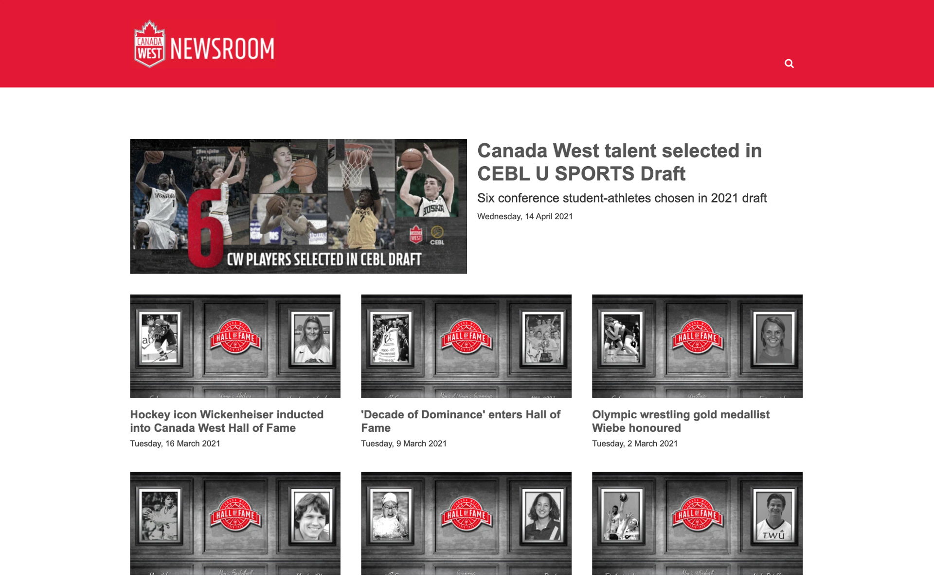
A sports and location-focused newsroom, Canada West has done a great job with its layout and matching up of its branding to make this a go-to asset for its media team.
Notice the date stamp on each post. This immediately shows that not only is the page well maintained (and therefore likely to reply promptly to media queries), but it also lets readers know how frequently they can expect to see updates – a valuable thing when it comes to planning those content calendars.
Insider tip: If you want to add the publication date of your press release into your text, but you don't want to fiddle about with finding out what that date is (or will be, if you haven't published yet), simply start typing "%" and you'll have the option to automatically insert a dynamic publication date.
Make your own newsroom with a free Prezly trial ▸

Example: A source of truth
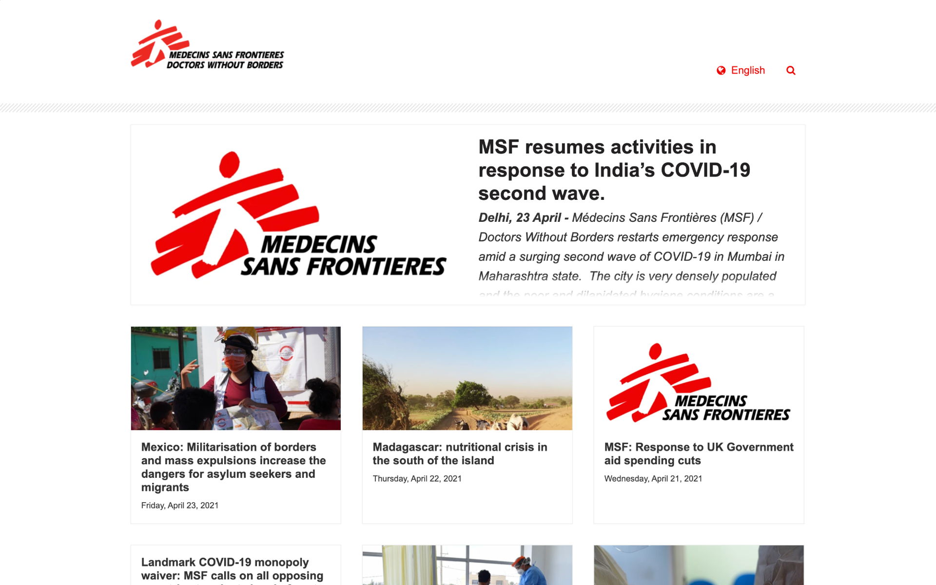
Médecins Sans Frontières (Doctors Without Borders, or MSF) has created an incredibly beautiful newsroom that is very on-brand, using the bright red of their logo to help highlight key topics and news.
This is also a great example of how to display multiple contact cards concisely – take a look at the bottom of the page.

Example: An international presence
There are different options available for publishing your own newsroom. If your brand (or your client's brand) already has a website set up, you could always speak with whoever handles your IT support or site setup about adding a newsroom directly to the main website.
But bear in mind, this is likely to have some drawbacks – most commonly, that to actually use your newsroom you will likely need to negotiate gatekeepers like developers or the digital marketing department.
For PR teams seeking a more independent and flexible way of working, using a dedicated newsroom builder is usually a better option. Some of the options dedicated PR newsroom software gives you include:
- Full control over the content published to your newsroom
- Quick setup features with no need for HTML or code
- Online hosting of digital media assets such as photos, videos, and press kits
- Integration of your newsroom with other parts of your PR workflow, such as pitching
- Branding options to make your newsroom look in line with your main brand
- Whitelabelling and integration options so you can make the newsroom look like it is part of your main brand website without giving up control over your content
Publish your own newsroom in just 5 minutes
Create a fully branded, multimedia, multi-language newsroom right now with a 14-day free trial of Prezly, no payment info required.
This is particularly helpful for PR agencies that need to handle newsrooms for multiple clients all at the same time since a newsroom builder lets your team collaborate on all your clients within the same tool.
For a practical example of what your newsroom setup might look like, let's go through the steps of setting up your newsroom in Prezly. If you want to follow along with the steps below, you can start your free trial here (no credit card details needed).
Try Prezly for free todayThese should clearly reflect your brand and the purpose of your site. If you're representing a local part of a global brand, then you might want to take this into account.
If you want to use your own brand's domain for your newsroom URL, you'll be able to set this up in your settings once your newsroom has been created, so don't worry about it for now.
Similarly, if you plan on publishing stories in multiple languages in your newsroom, set that aside for now and simply choose what you want your main newsroom title and URL to be. Any languages you later add to your newsroom will be automatically reflected in your URL, e.g. www.yourbrand.prezly.com/es for Spanish translations.
These will make up the frame within which all your newsroom stories are published and include:
- Boilerplate
- Main contact details and social media profiles
Once this is done, congratulations – you're ready to publish your first press release!
If you want to polish your newsroom a bit more before that happens though, there are a few more finishing touches you can add…
By default, your Prezly newsroom uses Bea – a theme specifically designed to balance visuals with copy and be responsive across all devices. If you prefer a more visual layout or want to change the colors and fonts used in your newsroom, you can do this through your theme settings.
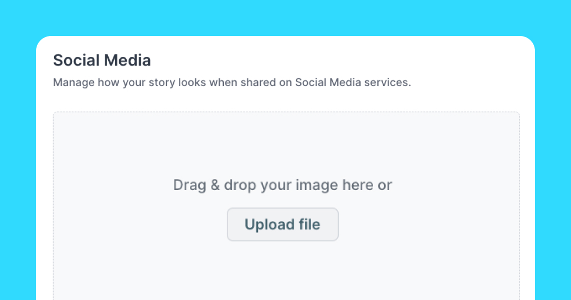
Toggling this option in your settings lets you add a simple email subscription form to your newsroom footer, which allows any journalists browsing your content to opt in to receive your press releases and so helps you grow your media list organically. Every little helps!
These are brand representatives who journalists should reach out to should they need more information for covering your story. We recommend adding at least one named newsroom contact, though you can of course add more if you wish.
You can choose which contacts, if any, display on your newsroom homepage, as well as easily insert these as contact cards into individual press releases, pitches, and campaigns.
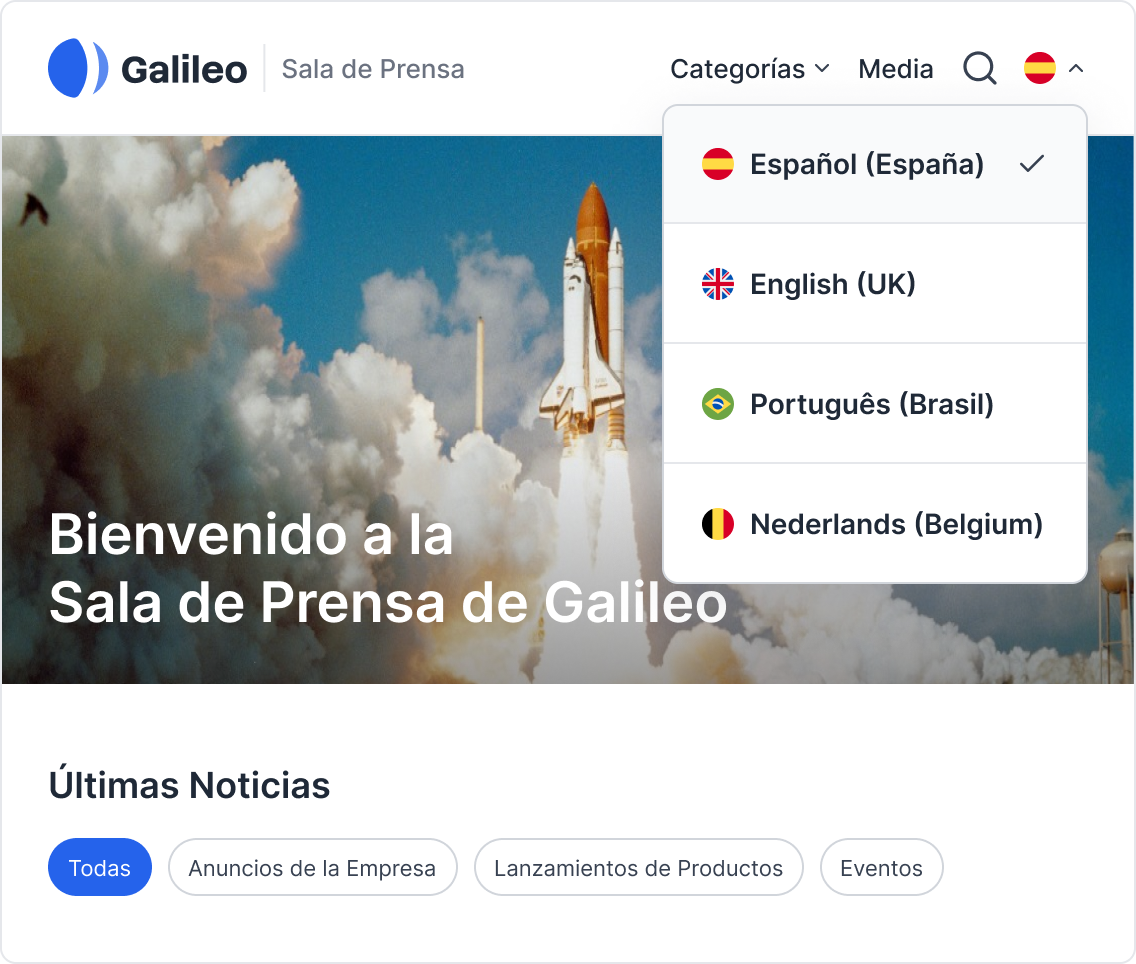
If you want your newsroom to be available in multiple languages, simply choose those languages in your settings and they will appear in your newsroom menu as soon as you publish a story in that language. You can also define how your boilerplate, categories, and so on will look in each language or locale you pick.
Translate your press release in seconds with Prezly
Publish your press release with Prezly and translate it into 30+ languages with our integrated DeepL AI auto translation feature, available in your 14-day free trial.
You have the option of adding a media gallery section to your newsroom, where you can store any media assets – like logo variants and hi-res photos – that journalists need. That means that any time you create a new press release, you can just embed a link to your media gallery into its body instead of spending eons faffing about with attachments.
Want to grow the reach of your press releases without lifting a finger? Head over to your newsroom settings and define how you want your newsroom to appear in Google search results. (Ok, so maybe you'll need to lift your finger once or twice.)
By default, your Prezly newsroom is discoverable in places like Google. If you prefer to keep your news on a need-to-know basis, you can make your newsroom private – yup, you guessed it – through your settings :)