Subtle branding that makes a newsroom feel unmistakably theirs
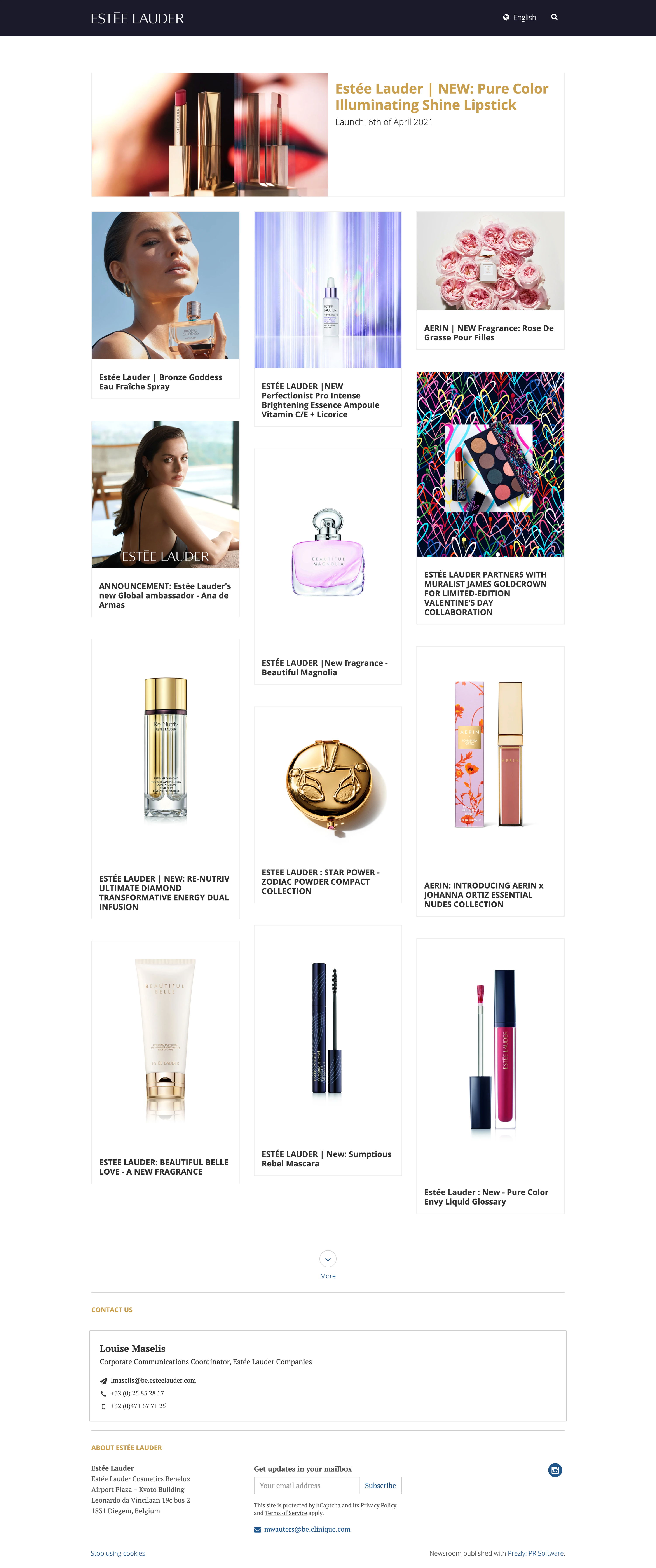
Estée Lauder's newsroom is a good example of how far a few small, considered tweaks can go. The layout is clean and minimal – but it's unmistakably on-brand, thanks to a handful of deliberate styling choices: a high-resolution logo, a coloured banner, a customised typeface, and gold font reserved for featured content.
That last detail is worth paying attention to. The latest story is given a gold header and displayed horizontally across the top of the page, making it immediately prominent without disrupting the flow of story cards below. It draws the eye without shouting.
The newsroom also makes use of Prezly's multilingual feature, allowing visitors to switch language versions simply by changing the country code in the URL – for example, /en for English or /fr for French. For a global brand managing communications across multiple markets, it's a clean and practical solution.