Setting the header image, cover image, and social image in your stories
Learn where to upload each image and where it appears
There are 3 types of images you can add to your story settings:
- Header image
- Cover image (also commonly called card image)
- Social sharing image
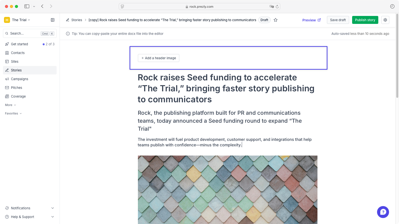
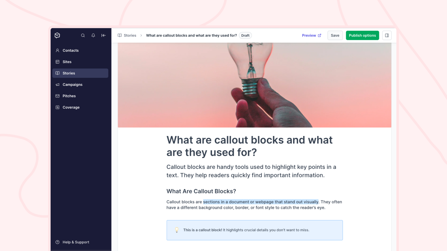
Add a header image by clicking "Add a header image" at the top of the story editor, or by drag and dropping an image above the title placeholder.
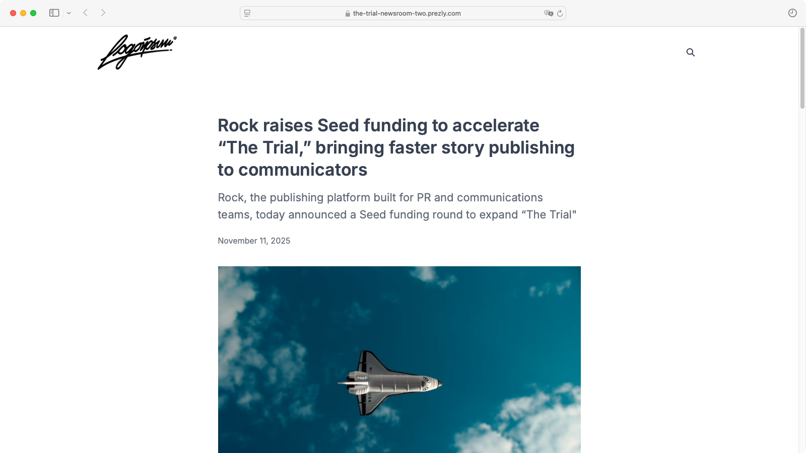
Once published, the header image appears just under the story title and subtitle.
You can change the header image position to appear above the title and subtitle in your site’s styling settings. See how in this helpful article.
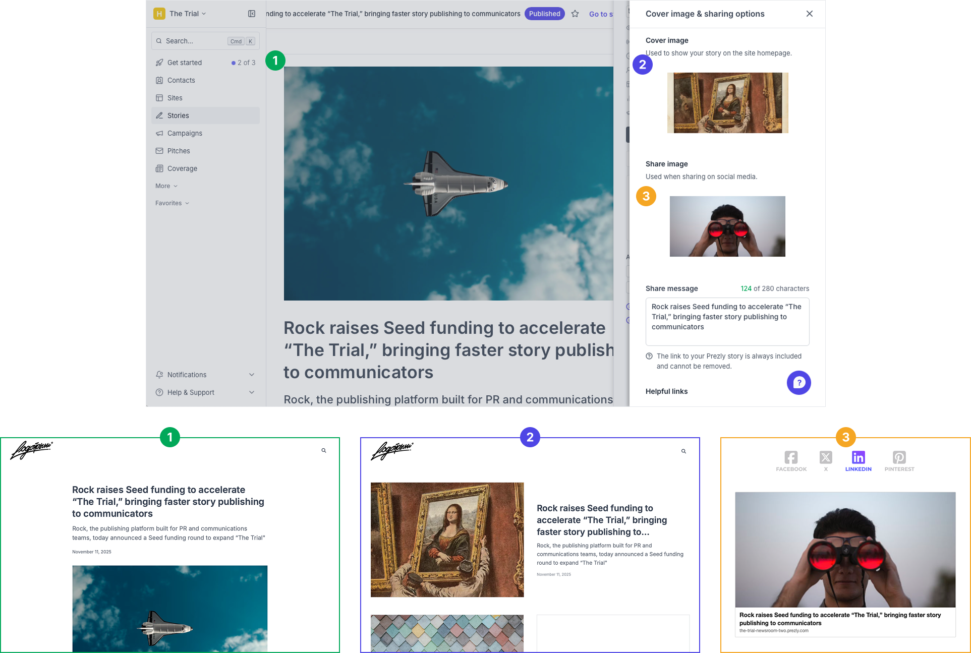
Here’s the difference between a header image and a cover image:
- Header images appear at the top of your story page in your site/newsroom.
- Cover images (or card images) appear on story cards across your site (for example, on your homepage).
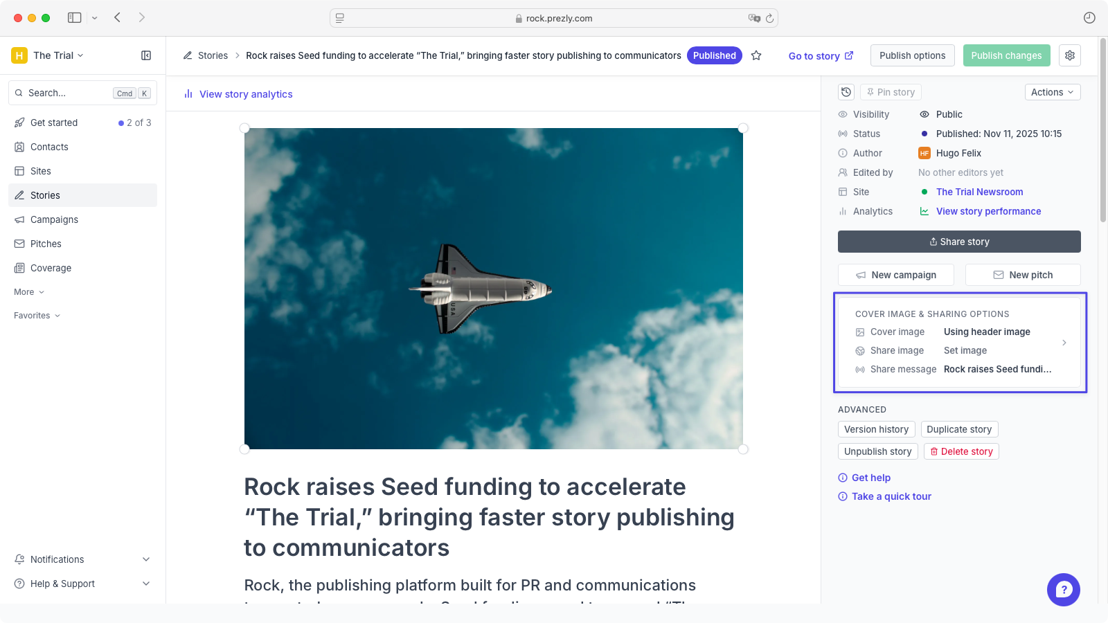
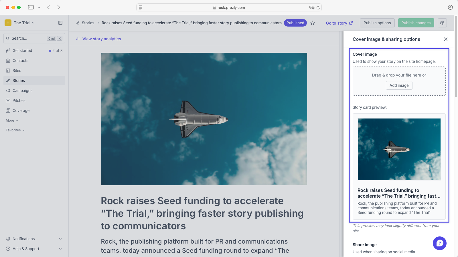
By default, the header image is used as the cover/card image. If you prefer a different image for cards, open the "Cover image & sharing options" section in the story settings panel and upload it there.
If you publish a story without a header or cover image, we’ll use the first image in the story as the cover image. If the story has no images, we’ll fall back to your site logo for the card image.
The social sharing image is used for previews outside of Prezly (for example, when sharing on social media).
By default, the social image uses your story’s header image. To set a specific social image, go to the Cover image & sharing options section, click Add image, or drop an image into the placeholder.
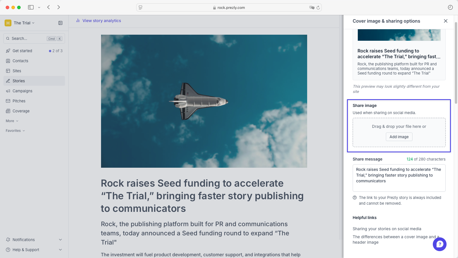
Tip: You can also set a custom social sharing message. This may appear as the post text in some social networks.
Here’s a quick visual overview of where each image is displayed across your site and external previews.
Each image has a different job, so use sizes that fit their purpose:
- Story header image: At least 926 px wide; aspect ratio is preserved. Avoid overly tall images so your text doesn’t fall below the fold. Because the header image may be used as your card and social image by default, avoid graphics or text that could be cropped.
- Cover image (card): Recommended 1200 × 900 px (4:3); minimum 650 × 490 px. Keep key content centered—edges may be cropped responsively.
- Social sharing image: At least 1200 × 630 px; larger is fine if you keep the same aspect ratio. Keep important elements within a safe area (around a 10% top/bottom margin).
Want more details on recommended sizes and dimensions? Check this detailed help article.
Social image