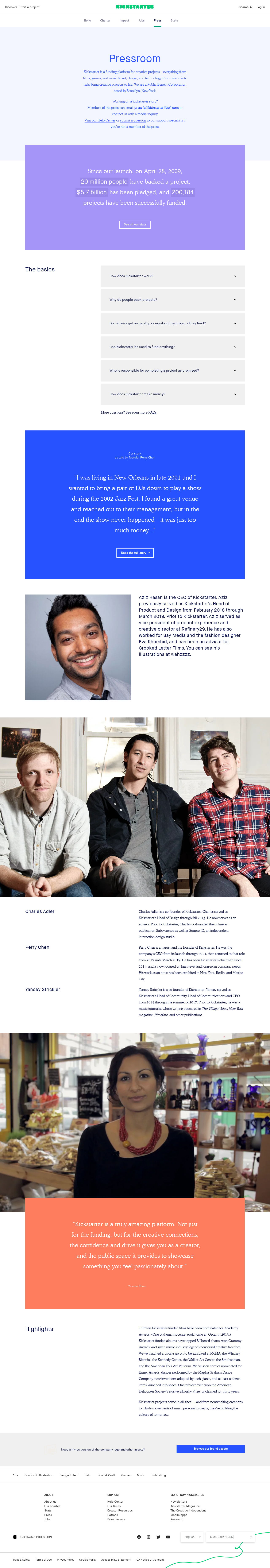
Kickstarter's newsroom injects creative freedom and playfulness into its design
Kickstarter has gone with a long-form press kit that is neatly divided into sections that catch the eye and that are easy to parse. The background info on the company takes a backseat – while positioned high up the page, "The Basics" section is grey and designed to take up little attention while remaining easily accessible for those specifically looking for it.
It rightly assumes that most people visiting this page already have a core understanding of what they do, thus allowing for more creative freedom and playfulness in their design.
Importantly, Kickstarter has recognized that visitors to its press page will not all be journalists. More likely than not, this page gets a lot of traffic from Kickstarter's clients.
You can see this evidenced by the way they put their people in the foreground. Where the other examples we've looked at prioritise coverage, contacts and assets, Kickstarter is keen to show you its human side, both in its team and in its clientele. Notice that big testimonial from one of its success stories? That's perfect social proof.