Introducing the new side navigation
A more structured & progressive interface that keeps things compact + frictionless 🙌
The previous navigation came with a number of limitations, such as scalability and consistency for different screen sizes. And it could appear very visually busy, which held us back from adding more useful links to the navigation, like Pitches, for example.
A left sidebar navigation has long been a faster and more effective way for users to find exactly what they're looking for to get their storytelling work done. So, we've redesigned the app's entire main navigation to help users better navigate our tool though a vertical set of options that is quicker and easier to scan. It's simply a more structured and progressive interface that keeps things compact and frictionless
With that in mind, we'd like to announce our brand new side navigation layout!
The biggest change you'll see is that all options featured in the current navigation have been moved to the left-hand side of your page, and that all of your pages' content still remain even when you minimize your browser size.
However, there are also several other small but mighty updates you'll find in the improved navigation!
The Search and Notifications have been minimized to icons (🔍 and 🔔), adding more focus to the menu items, but they're always there when you need them.
Our Help & Support options are easier to find in the bottom left corner.
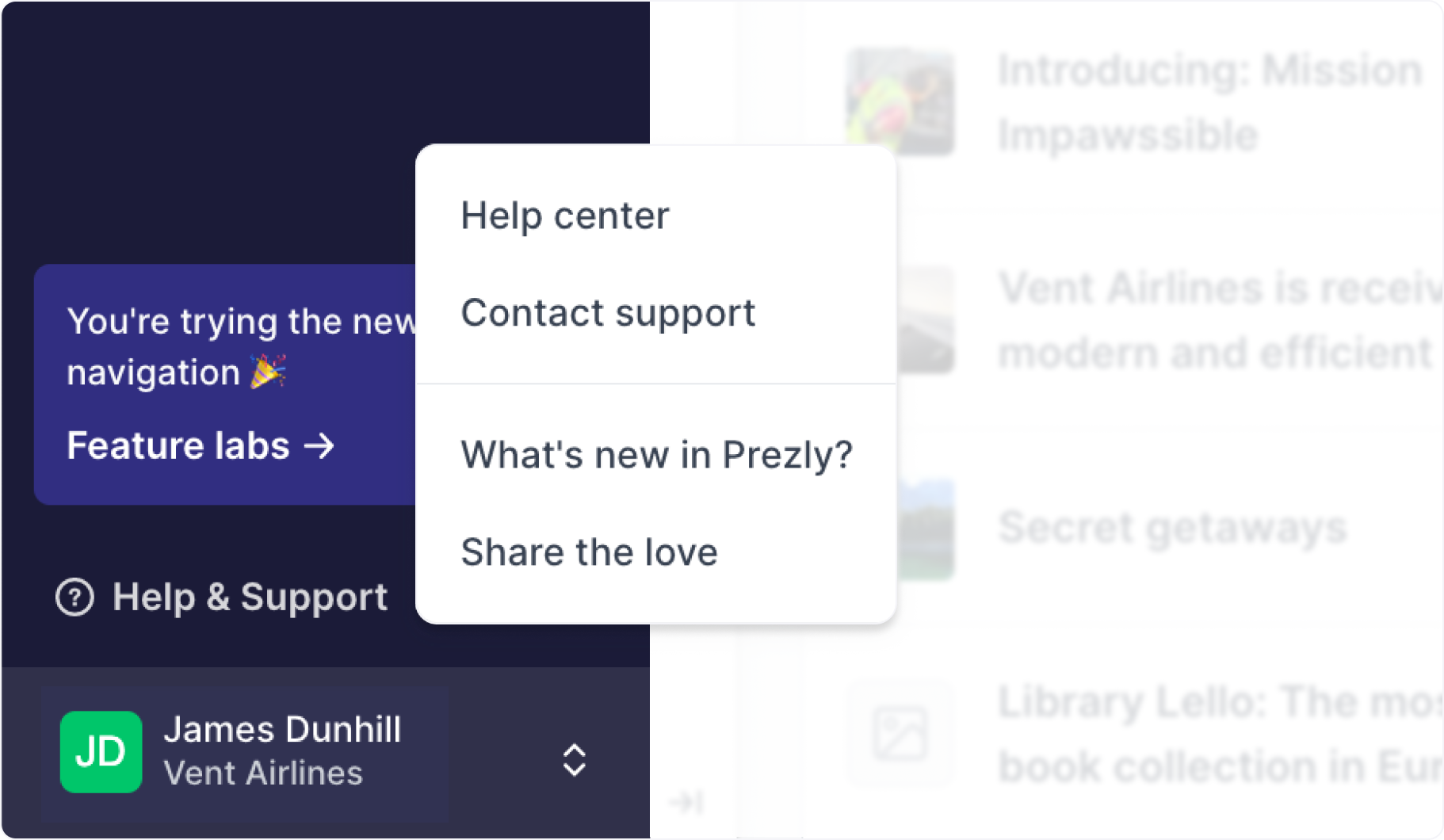
We've added more emphasis on your Account & Organization settings by implementing a double-headed arrow next to your name, account name, and avatar.

We’d be very grateful for all suggestions and feedback, even when it’s tough – go all out, we want to hear it all
Klarissa Djajalie